SIMPLY THEA / FREELANCE
Simply Thea
Building a Distinctive Identity Across Brand and Product
Simply Thea was developed as a flexible visual identity built to give expressive artwork a clear and recognisable brand framework. My role covered the identity system, brand guidelines and its application across digital, product and lifestyle visualisation.
BRAND CHALLENGE
Creating an identity with room to grow
The challenge was to create an identity with enough personality to stand alongside expressive artwork without competing with it. At the same time, the system needed clear rules around logo use, colour, typography and spacing so the brand could remain controlled as it moved into new applications.
IDENTITY DIRECTION
A bold identity built around recognition
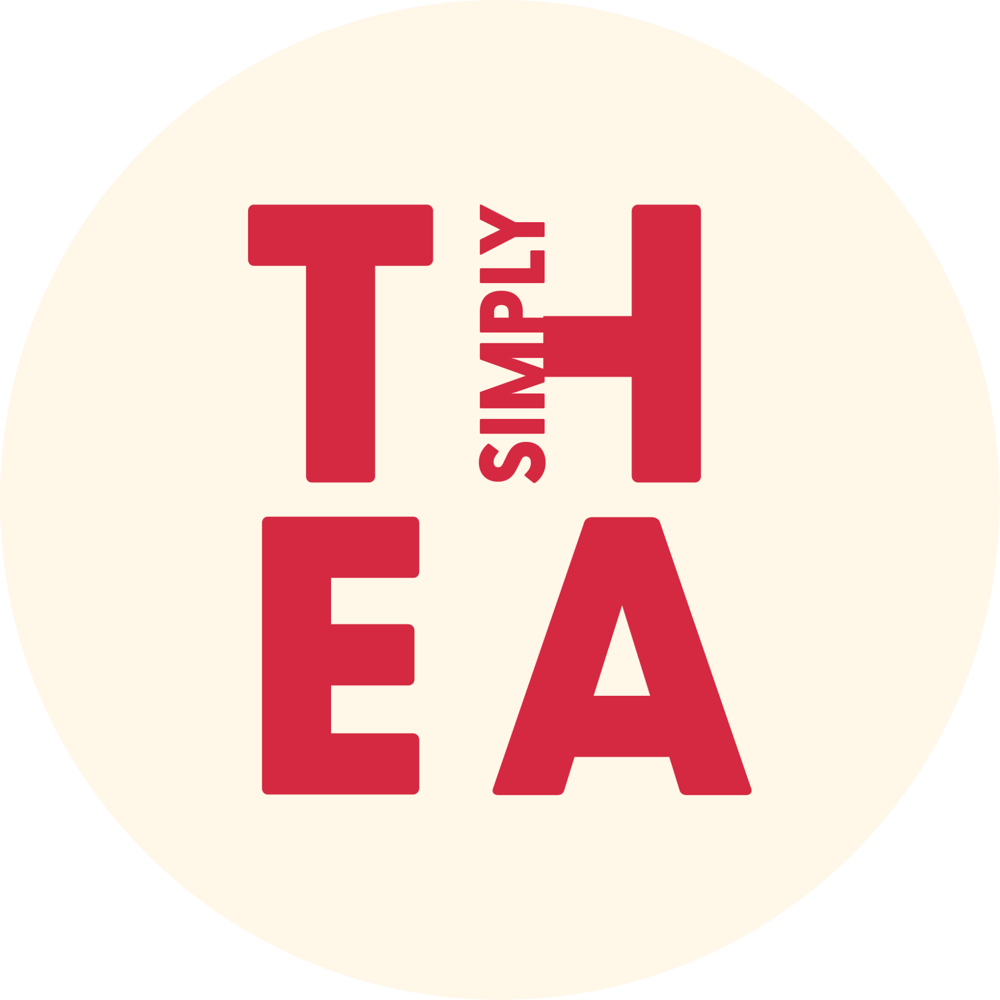
The identity combines a distinctive wordmark with a warm, characterful palette and strong typographic contrast. Rather than allowing the artwork to define every application independently, the brand system provides a consistent framework that gives the work a recognisable Simply Thea presence.
LOGO SYSTEM
Designing a flexible logo system
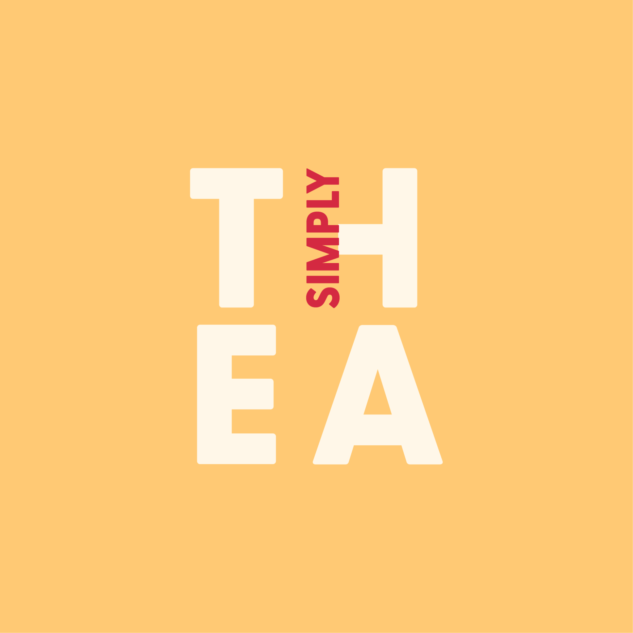
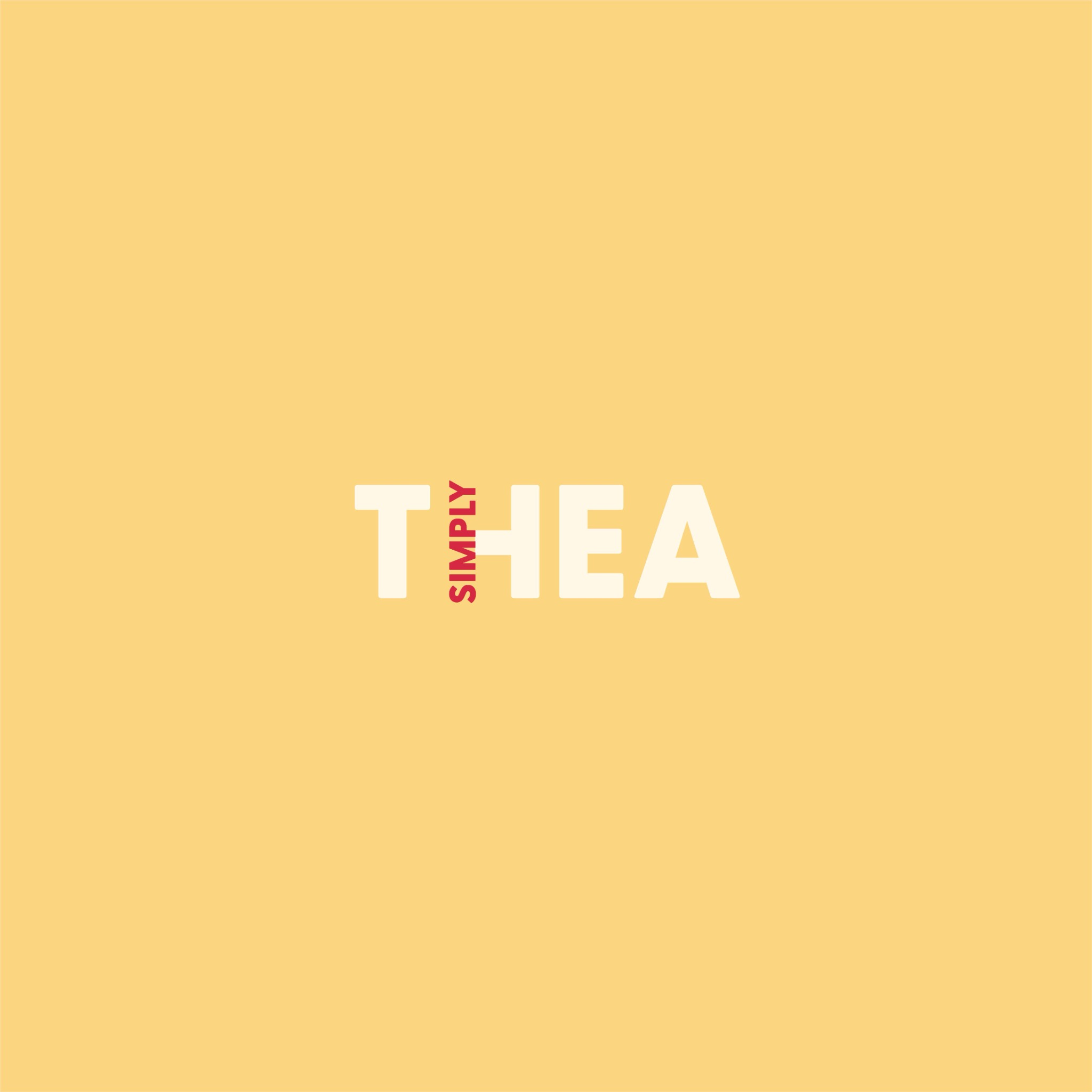
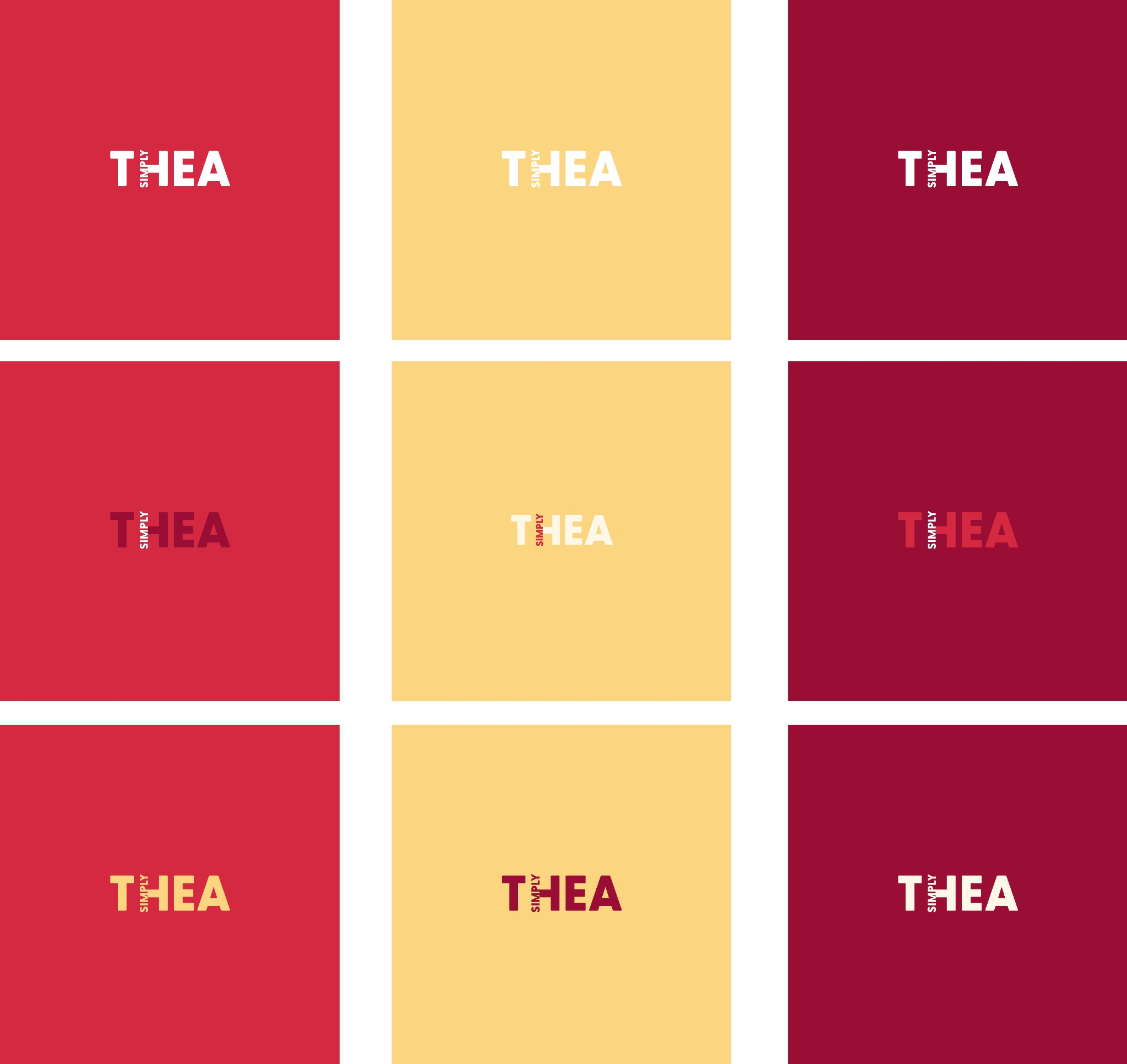
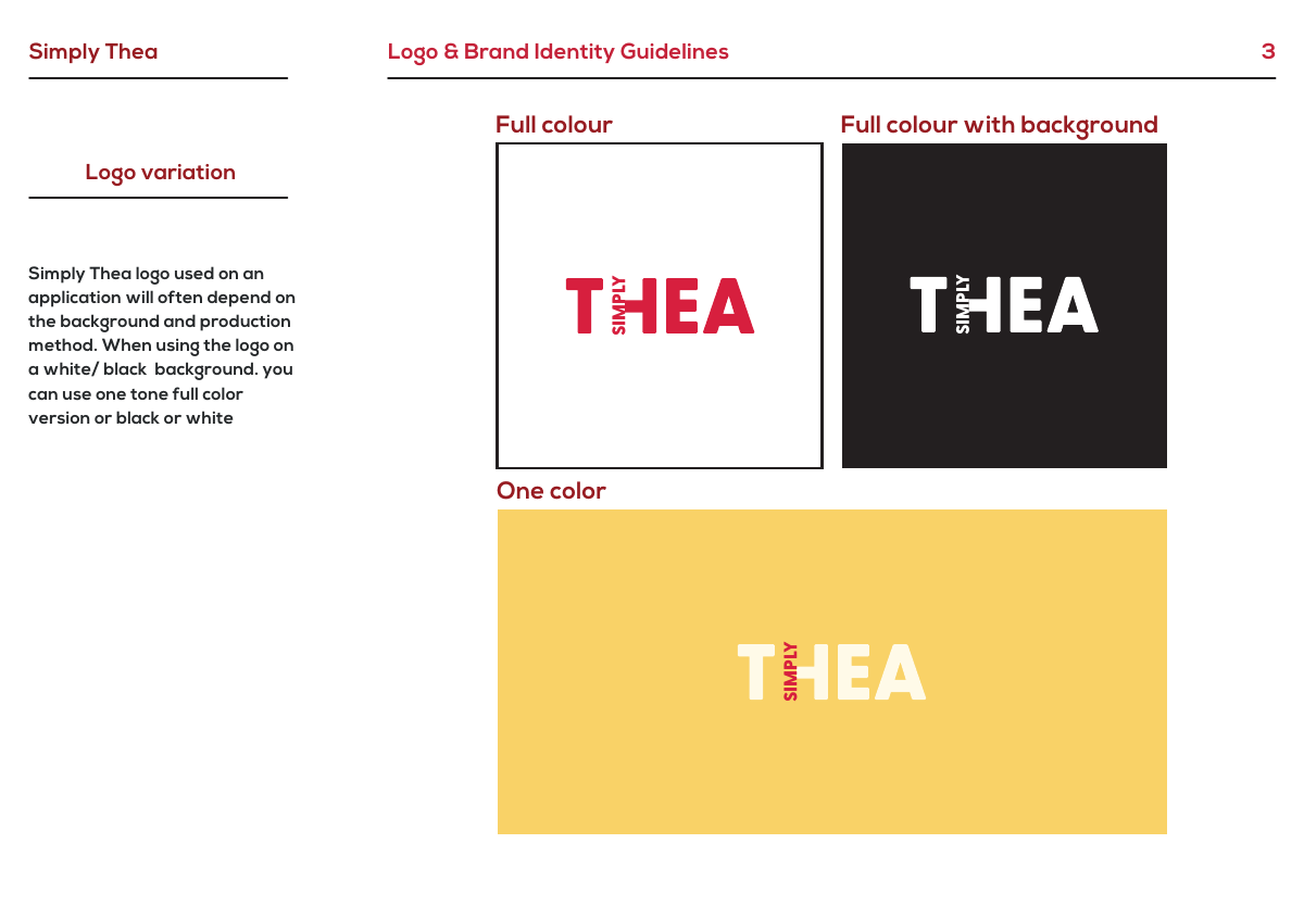
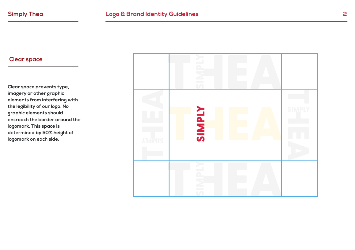
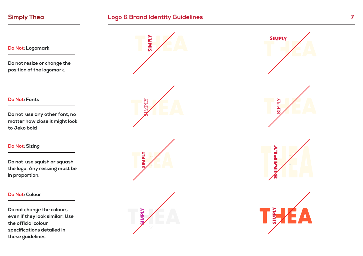
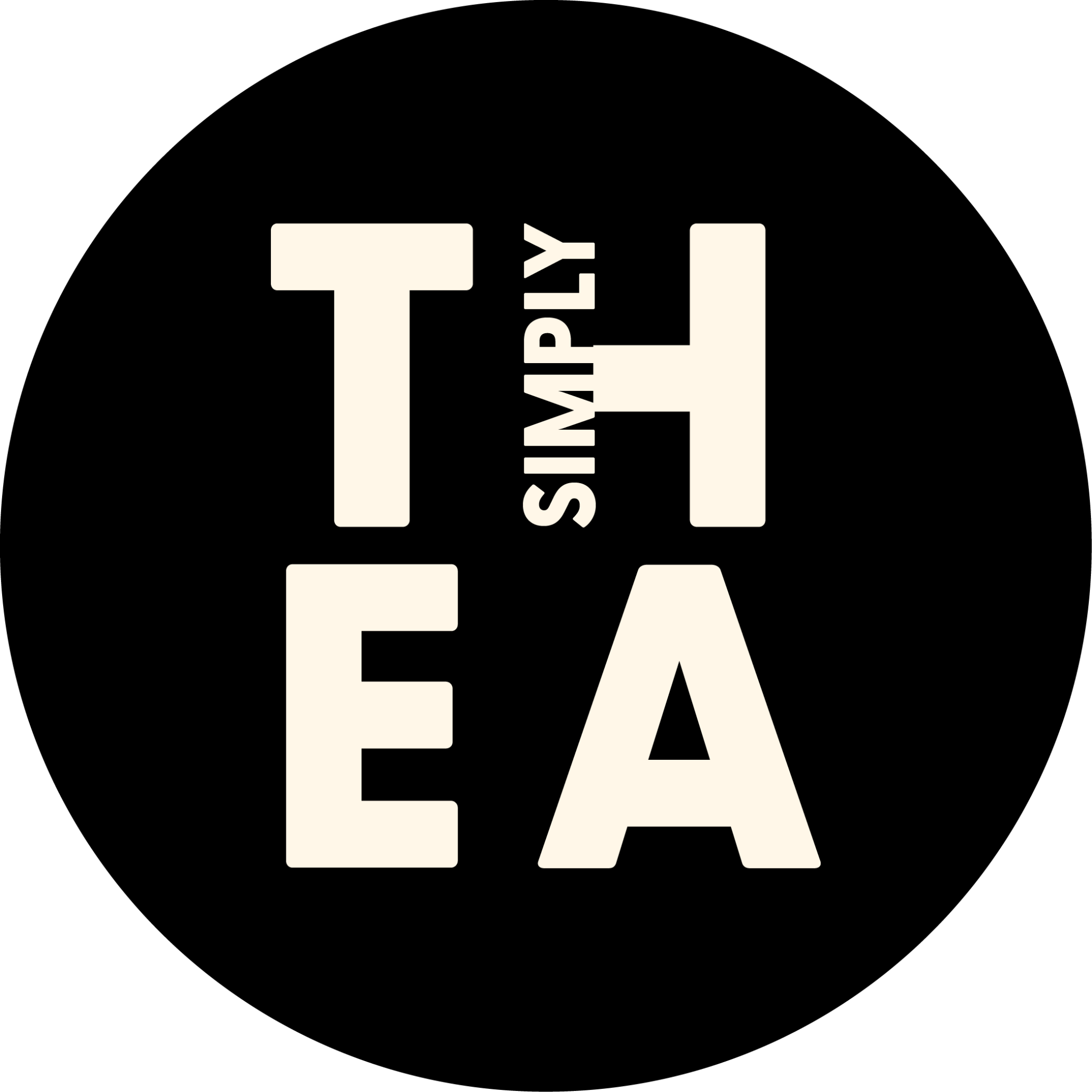
The logo was developed as a system rather than a single fixed mark. Approved variations allow it to respond to different backgrounds and production requirements, while defined clear-space, colour and proportion rules protect the identity from becoming inconsistent in use.
COLOUR & TYPE
Building consistency through colour and type
The supporting palette and typography give the identity structure around the more expressive artwork. Warm yellow, red and neutral tones create a distinctive foundation, while the typographic hierarchy keeps communication clear and gives the wider system a more controlled visual rhythm.
- #FCD581
- #D52941
- #FFF8E8
- #990D35
TYPOGRAPHY
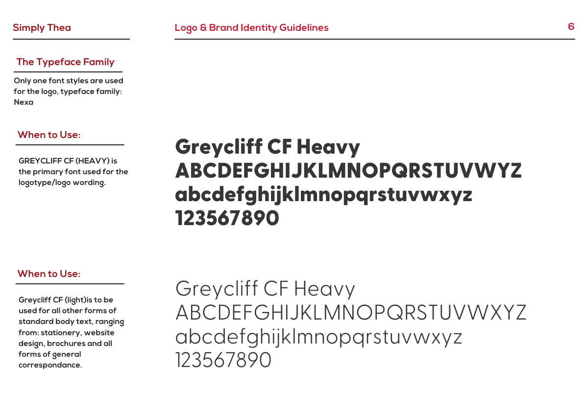
Typography designed for consistency
Contrasting type weights separate prominent brand messaging from supporting detail, helping readers navigate the content without competing with the artwork.
BRAND GUIDELINES
Turning the identity into a usable system
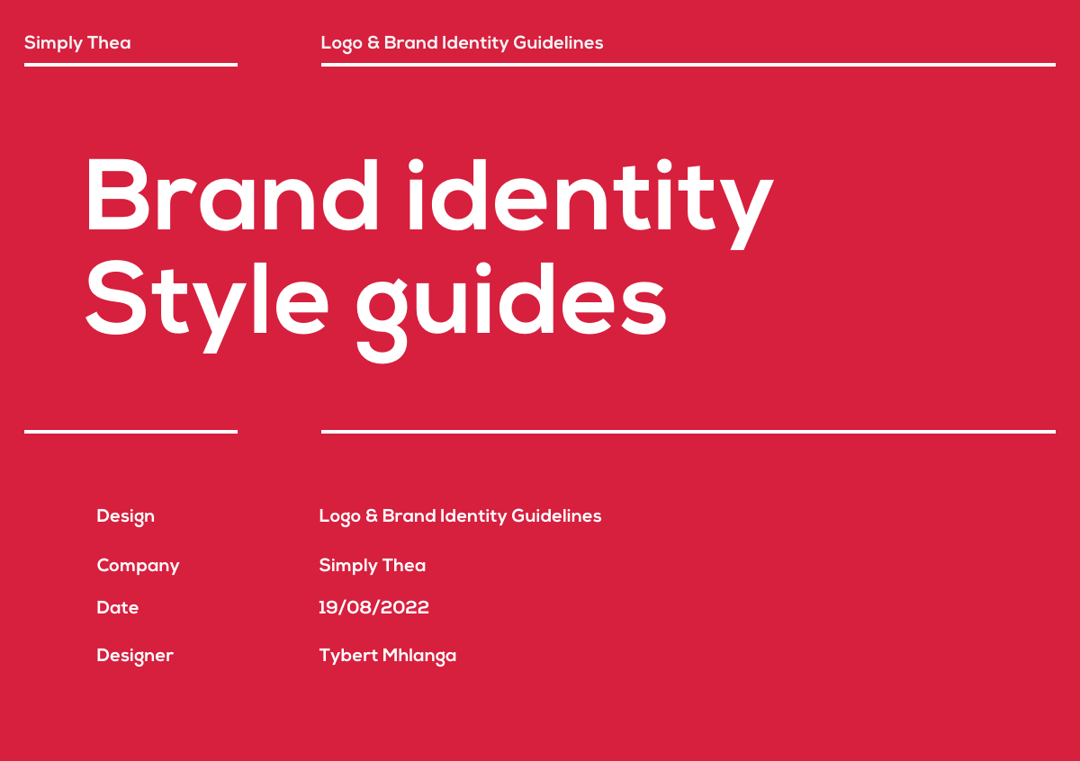
Documenting the identity was an important part of making it practical. The guidelines define how the logo, spacing, colour, typography and supporting elements should behave, creating a reference that allows the brand to be applied consistently rather than relying on individual design decisions each time.
SOCIAL APPLICATION
Applying the identity in a digital context
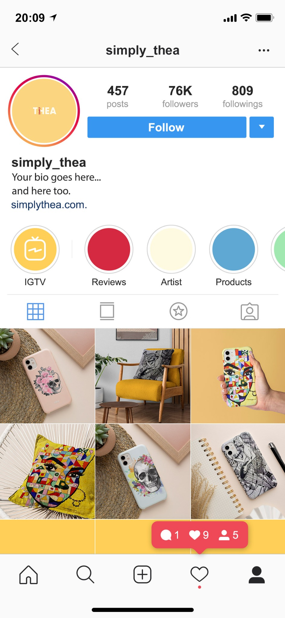
Digital application provided an opportunity to test the identity outside the controlled environment of the guidelines. The system needed to retain its personality while accommodating content, imagery and tighter spatial constraints without losing the core brand character.
PRODUCT VISUALISATION
Product Visualisation & Application
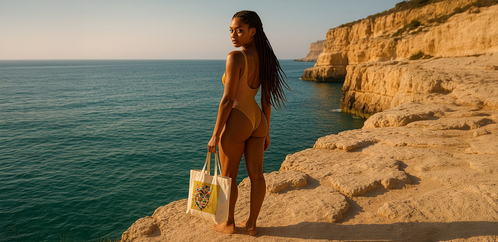
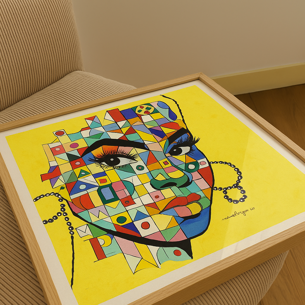
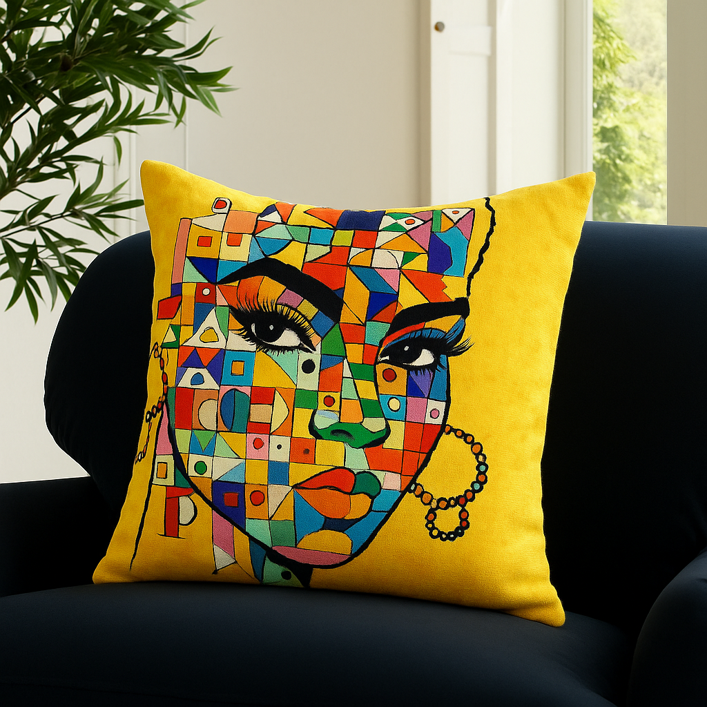
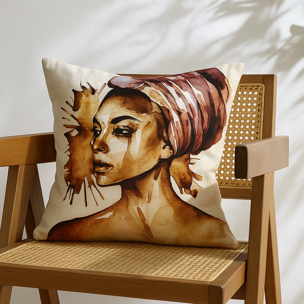
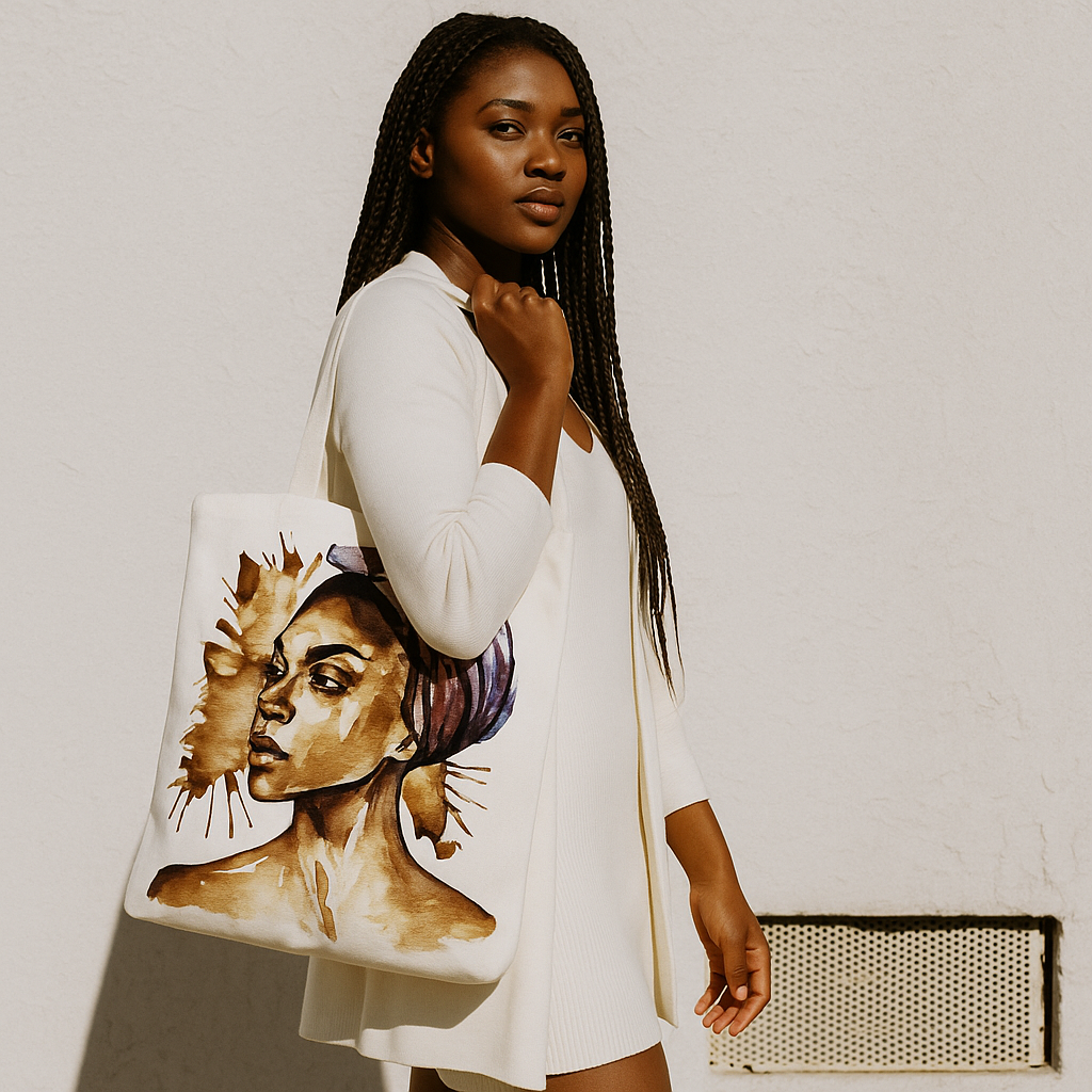
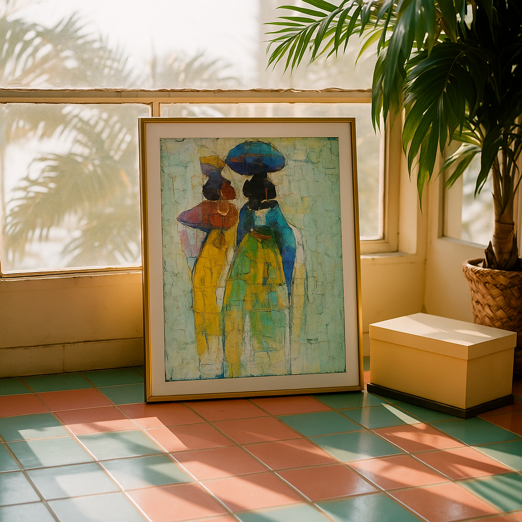
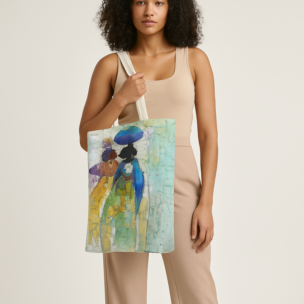
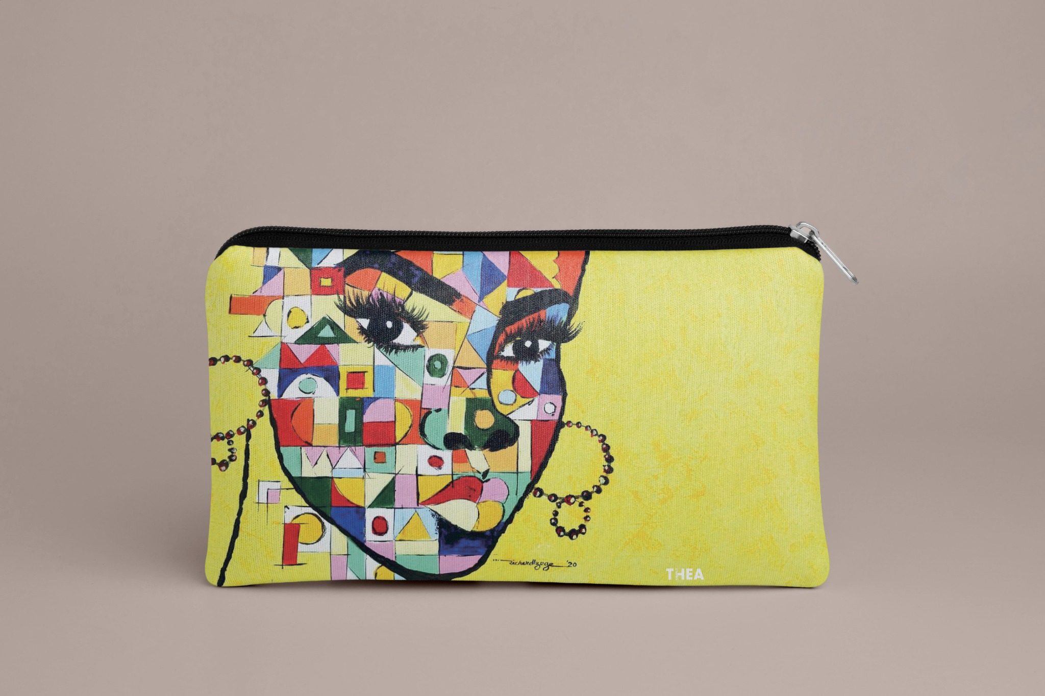
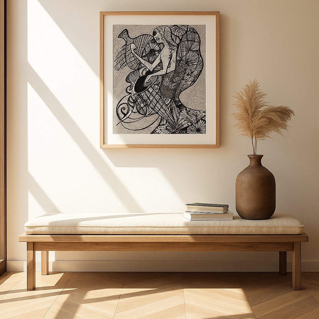
The brand was then explored in product and lifestyle contexts through a series of digitally constructed visualisations. Using Photoshop compositing alongside AI-assisted image generation and editing, I applied the artwork to products and environments while controlling scale, perspective, lighting and surface behaviour to create convincing commercial-style imagery.
VISUALISATION CRAFT
Building believable product visuals
The realism of each mockup depended on more than placing artwork onto a product. Scale, perspective, material behaviour, shadows, lighting and environmental context all needed to work together. AI-assisted generation helped establish and refine scenarios, while Photoshop was used to composite, adjust and control the final presentation.
VISUAL CONSISTENCY
One identity, multiple expressions
From the core logo system to social content and product visualisation, each application uses the same underlying brand principles while allowing the artwork itself to remain expressive. This balance between structure and flexibility is what allows the identity to feel coherent without making every execution look identical.
MY CONTRIBUTION
My role covered the development of the Simply Thea visual identity, its supporting brand guidelines and the translation of that system into digital and product applications. I also created the lifestyle and product visualisations through Photoshop compositing and AI-assisted production, using these tools to present the artwork in convincing commercial contexts while maintaining the integrity of the original work.